Login with RealMe

To access the Procurement online service, you need a RealMe login. If you've used a RealMe login somewhere else, you can use it here too. If you don't already have a username and password, just select Login and choose to create one.

What's RealMe?

To log in to this service you need a RealMe login.

This service uses RealMe login to secure and protect your personal information.

RealMe login is a service from the New Zealand government that includes a single login, letting you use one username and password to access a wide range of services online.

Find out more at www.realme.govt.nz.

Wayfinding and signage

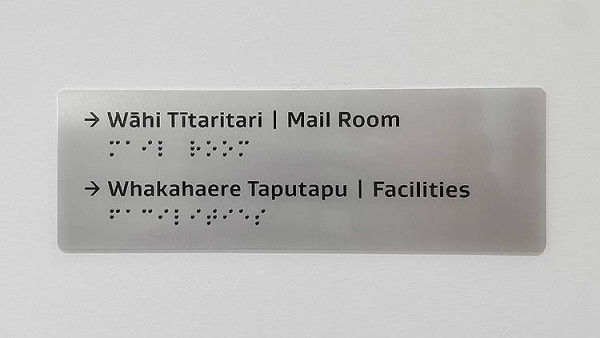
Well-designed signage provides additional information using text, colour or images to complement colour as a way to navigate an office space.

Signage

In government office buildings, signage and information should:

  • enable people to clearly understand the layout and function of a space
  • allow people to find their way around independently
  • be usable, informative, simple and easy for everybody to understand.

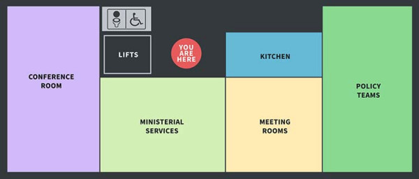
In multi-storey buildings, signage should be used together with colour to differentiate individual floors to help with navigation of lift lobbies.

According to Standards New Zealand, signs have three functions:

  • Informative: advising about availability of facility or service.
  • Directional: directing to a specific facility.
  • Locational: identifying the place where the facility is provided.

NZS 4121:2021 Design for access and mobility: Buildings and associated facilities – Standards New Zealand

Street numbers

Display the street number of the building somewhere plainly visible, as this is commonly used to locate buildings.

Naming rights

The Government does not seek to purchase naming rights for leased office buildings. Naming rights are usually held by the building owner and can be included as part of a package deal for leasing an entire building.

Any changes to a building name should not conflict with an agency’s existing contractual naming rights obligations under their existing lease. If there is an opportunity to rename a building, an agency can consult with local Iwi and be gifted a name that considers the history and links to the location of the building. The gifted name would be unveiled as part of the blessing of the building.

Bilingual signage

Follow Te Puni Kōkiri’s bilingual signage guide – developed with Te Taura Whiri i te Reo Māori – and the glossary, for common Māori terms when planning signage requirements. The New Zealand Government is committed to supporting Tikanga Māori, and ensuring all signage supports this commitment is an important step. The signage guidelines include four key principles:

  • Responsive and accessible services
  • Visibility of language
  • Equality of languages
  • Quality of language.

Support services are available to agencies  particularly for language support, and support on correct dialects  including access to case studies and language experts. Contacts for these support services are listed in the bilingual signage guide.

Māori-English Bilingual Signage – Te Puni Kōkiri Ministry of Māori Development

Te Taura Whiri i te Reo Māori has several translation resources, including names for common rooms, spaces or terms used in the workplace.

Reo Māori Resources – Te Rangaihi Reo Māori

Braille

The accessible spaces guidelines recommend braille, high contrast tactile print and large print signage in all public accessed buildings and spaces. These guidelines recommend best practice for the design of signage used by people who are blind, deafblind or have low vision.

While the implementation of the bilingual and accessible spaces guidelines are not mandated or legislated, we strongly encourage you to include a combination of both guides in your office signage to benefit everyone using agency spaces.

Make sure the signage is installed to be within reach by either someone standing or in a wheelchair.

Accessible spaces - Blind Low Vision NZ

A metal grey sign on a light grey wall. The words are written in teo reo and English, with braille versions underneath.

An example of te reo, braille and accessible signage

Symbols and typography

Signage symbols and arrows

The use of symbols is beneficial to people whose first language is not Māori or English, and people who have learning difficulties. Universally recognised symbols may be used in place of text. Other symbols should be accompanied by text and are useful on bilingual signs to enable quick recognition of information.

Pictorial assistance, such as arrows, is essential for directional signs. Arrow use needs to be consistent throughout a system of signage.

Where signs include a list of destinations, such as on a directory sign in an entrance area:

  • group destinations that are located in the same direction should be represented with a single arrow
  • the position of arrows on a sign in relation to the location name should correspond with the direction in which it is pointing.

Placing an arrow in relation to the name of a location reinforces the directional information. Be careful to limit the use of arrows, as repeated arrows are likely to clutter a sign and make it more difficult to read.

A set of symbols common to building signs.

A variety of symbols used on building signage

Typography and lettering

The New Zealand Government identity uses Ideal Sans as its primary typeface. This helps reinforce the tone of government messaging: not overly formal, easily accessible and approachable, while still being confident and genuine.

The alternative typeface is Source Sans Pro. This is for general use, in cases outside of designed artefacts and when Ideal Sans is not available. The font is available in all Microsoft Office products.

Key principles for accessibility:

  • text size and proportion of lettering must be in accordance with Clause F8 of the New Zealand Building Code
  • large or complex serifs may reduce legibility and should be avoided
  • avoid highly stylised or simulated handwriting and typefaces
  • typefaces are available in different weights; avoid light options as there is less contrast between paper and text
  • avoid italics, which can be difficult for some people to read
  • bold type can be used to emphasise text
  • avoid using all capital letters in words for non-building code signage. The human eye recognises the shape of words and a word in all capitals is harder to recognise
  • use a typeface that makes numerals distinct
  • avoid using text over images or patterned backgrounds
  • make sure there is a strong contrast between the text and the background.

New Zealand Building Code: Clause F8 signs – Building Performance

Legibility distance and positioning

Legibility distance dictates lettering size for people to become aware of and recognise a sign from a given distance. Minimum standards for viewing ranges and positioning are defined by Standards New Zealand.

NZS 4121:2001 Design for access and mobility: Buildings and associated facilities – Standards New Zealand

DeafSpace considerations

DeafSpace is an approach to architecture and design informed by the unique ways in which deaf people perceive and inhabit space. Deaf people receive limited information through auditory channels and mainly rely on the peripheral, visual environment.

Why DeafSpace Now? – DeafSpace

DeafSpace – Gallaudet University

Things to consider when allowing for DeafSpace within the office environment:

  • Transparent or opaque glazed walls and doorways with appropriate frostings to see if other people are approaching.
  • Encouraging natural and diffused light while eliminating glare and shadow patterns.
  • Allowing enough space in thoroughfares to allow people to sign, side by side, without obstacles.
  • Avoiding colours that match skin tones.
  • Adding reflection elements, particularly adjacent to signage, to help in realising if someone is approaching from behind.
  • Providing open plan offices to minimise reverberation and background noise though a combination of acoustics and using our principles of workplace design.

Principles for good workplace design

Neurodiversity accessibility

Neurodiversity refers to variations in the human brain with regard to mental functions, in a non-pathological sense. This includes things like social cognition, attention and learning.

The variations also include higher abilities in some areas than the average population. Just like how different people can glean different knowledge from the same point of reference, different individuals can have a range of reactions to audio, visual, and tactile stimuli.

When designing spaces, be mindful of the following complications and their possible solutions:

  • Include sound baffling where possible to mitigate chaotic background noise.
  • Minimise reflective surfaces where they aren’t needed to cut down on visual overstimulation from light sources.
  • Avoid a wide range of colours, opting instead for gradients and simple reoccurring patterns.
  • Consider creating spaces that contain a collection of common elements throughout the office environment. This can help produce a sense of visual order.
  • Place centralised landmarks like a kitchen space or a stairwell which can help with orientation.
  • Think about how noisy the office environment might be when it is in full use – with people, kitchen noises (crockery, coffee machines, etc) and photocopiers.
  • Consider designing a range of areas:
    • collaboration areas (meeting rooms, kitchens, break-out rooms)
    • quiet workstations where neurodivergent people can concentrate on their work and perform at their best away from distractions (quiet single pods, quiet offices for a handful of people in an enclosed space).

Directory boards and sitemaps

Main directory board and sign-in kiosks

Main directory boards help visitors know where they need to go in a building. Sign-in kiosks at reception are a good way to manage security, speed up reception time, and automatically notify workers when external visitors arrive.

Digital directory boards

Electronic main directory boards can contain large amounts of information while displaying only as much as a viewer needs. They can be updated easily and can be used to display greetings for visitors.

Ensure the board is in a prominent location, at a suitable interaction and reading height, and uses text that's large and high contrast, with minimal to no background.

Consider displaying New Zealand Sign Language on electronic main directory boards, as they can be animated to communicate in ways static images cannot. This could be displayed as a welcome video for the agency.

Principles for directory boards and kiosks

  • Primary signage should be Te Kawa Mataaho Public Service Commission prescribed New Zealand Government Identity, followed by agency signage.
  • Main directory boards and kiosks should allow for various heights and use appropriate colours to meet accessibility needs.
  • Place digital directory boards at no more than 1,700mm above floor level, or at table height for improved accessibility.
  • Organise the directory alphabetically for a single storey building or by building level for multi-level buildings.
  • Use simple terminology. If an agency or branch is known by the general public by a certain term, use that term.
  • Ensure signage is a size visible to all entering the building.
  • Locate signs with enough space for multiple people to stand around them and still be able to see information.
  • Don't use site maps for main directory boards in multi-level buildings – they will be too complex and require more frequent updating. Maps are generally supplementary and for orientation at each building level.
A photo of a main directory board near the reception desk in the lobby of a government building.

The main directory board in a building lobby

Interior sitemaps

In large, multi-storey buildings, where visitors may not be familiar with the layout, a floor plan or map should be displayed near the lift lobby on each level. Ensure the details are not too complex.

Be consistent and group destinations, like organisational levels or neighbourhoods, where possible. Tactile maps provide valuable orientation and wayfinding information for people with visual impairments.

Interior site maps should allow for various heights and use colours to meet accessibility needs.

A floor plan map of a single floor of a government agency building, with area purposes marked.

An example of an interior sitemap

Notice boards and whiteboards

Notice boards

Install notice boards in utility areas near printers to display brief, important and informal messages that are mostly intended for staff.

Discourage staff from installing notices in other areas of the office – this can interfere with wayfinding and accessibility, particularly for new visitors or people with visual impairments.

Notice boards should not be the only way to communicate informal messages; digital messages like email are more convenient and more accessible.

Fixed and temporary whiteboards

Whiteboards are useful in enclosed meeting rooms, as well as in collaborative spaces for teams to brainstorm or work on projects.

Whiteboards that are fixed to the wall should not be near quiet or focus areas. They should be placed at a height that can be used by all workers, including those with accessibility needs. We recommend against using methods like post-it notes or pinned sheets of paper for collaboration, as it looks unprofessional.

Top