Login with RealMe

To access the Procurement online service, you need a RealMe login. If you've used a RealMe login somewhere else, you can use it here too. If you don't already have a username and password, just select Login and choose to create one.

What's RealMe?

To log in to this service you need a RealMe login.

This service uses RealMe login to secure and protect your personal information.

RealMe login is a service from the New Zealand government that includes a single login, letting you use one username and password to access a wide range of services online.

Find out more at www.realme.govt.nz.

Visual contrast and colour selection

Careful selection of colour palettes and visual contrast improves the levels of comfort and spatial awareness of staff and visitors.

Visual contrast

Visual contrast between surfaces and features in a building helps people with visual impairments to:

  • navigate safely around the workplace
  • identify features and potential obstacles
  • determine depth and space more easily.

Effective visual contrast promotes visual clarity, orientation, and the perception of space.

Natural and artificial lighting design should be applied in accordance with the Government Building Performance specification. For more information, email the Government Property Group team.

An example of low visual contrast, showing a white chair on a white wall with a grey floor.

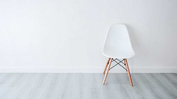
This is an example of a low visual contrast image.

An example of high visual contrast, showing a white chair against a purple wall with a grey floor.

An example of a high visual contrast image.

Measuring contrast

You can measure the contrast of surfaces like walls, floors, ceilings and doors by the light reflectance value (LRV). The LRV is a measure of the amount of light that a surface reflects and is represented by a scale from 0 to 100; where 0 represents a fully absorbing surface (black) and 100 a fully reflecting surface (white).

An image showing an example of LRV on one side (a set of white ceramics on a black table) and a chart of colours with different LRVs on the other.

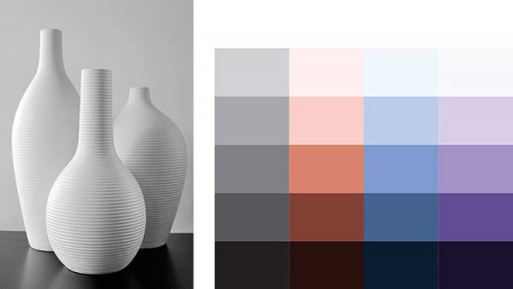
Left: These ceramics show LRVs at work. They have a high LRV, and are sitting on a surface with low LRV; right: A chart of LRV’s ranging from 0% to 100% in four different colours.

A picture of an office environment, with percentages indicating the LRV from 0% on the carpet up to 100% on the ceiling.

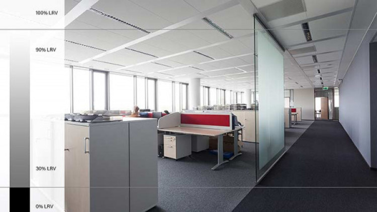
An office environment with the recommended light reflectance values

New Zealand Government colour palette

Agencies should use similar colours to those shown in this colour palette, in complementary colour combinations.

The use of patterns can affect depth perception for people with visual impairments; the section on implementing these guidelines below has more detail on which patterns may be used where.

A grid of colours showing the recommended palette for New Zealand government.

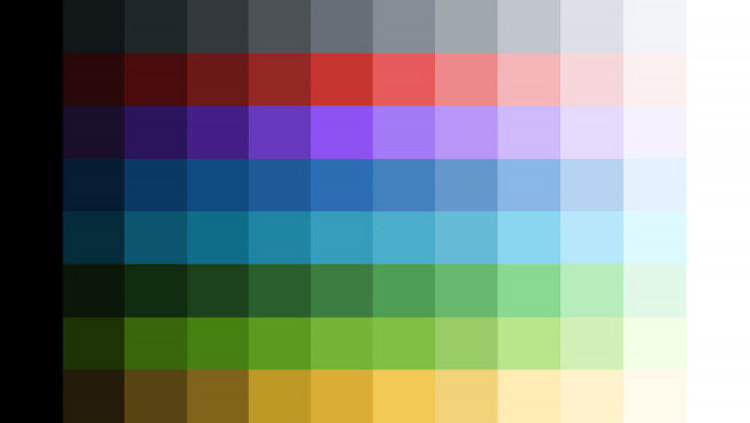
A colour palette showing the suggested colours for government

A colour study of Aotearoa

Natural landscapes and cultural heritage help create the aesthetic backdrop of the national identity.

These colours often revolve around blue, particularly from sea and sky, as well as rich greens and reds. Using these colours in your workplace design can help to reflect Aotearoa within the office environment.

Theming the office environment

Six images showing commonly reoccurring colours throughout New Zealand.

Six images showing commonly reoccurring colours throughout New Zealand

Implementing these guidelines

Effective visual contrast helps people with visual impairments navigate safely around the workplace, and promotes visual clarity.

These tools can be used to help determine visual contrasts:

Colour and contrast – Te Tari Taiwhenua Department of Internal Affairs

Colour contrast determinator – Vision Australia

Ceilings and walls

In most cases ceilings are tiled or coloured white with an LRV of 90 to 100%, so for good visual contrast walls adjoining the ceiling should generally have a LRV rating of 70% or less.

Adjacent walls

Aim for a colour gradient difference between two adjacent surfaces of at least 30%. For large areas, a difference in the LRV of at least 20% is acceptable, as long as the illuminance on the surfaces is in accordance with the Government Building Performance specification.

Wall-to-wall contrast helps when colour is being used as a tool to help wayfinding.

Signage

To make signage visible within the wider office environment a signboard should contrast visually with the wall behind. The text, pictogram or number should contrast visually with the signboard. For example, white lettering on a dark grey sign with a LRV difference of 30% will provide visual contrast.

Meeting room numbers or identifiers should be placed on the door and glazed areas avoided as it is difficult to apply contrast with frosted glass.

Full height glazed walls

Full height glazed walls can present a potential danger when mistaken for open doorways. In enclosed office meeting rooms, privacy also needs to be considered.

Any markings should contrast visually with the background surfaces viewed through the door in both directions and in all lighting conditions. Using two-tone markings often improves visibility.

The signage used to identify the room should be clearly legible and contrast with a glass door.

The recommended range for full height glazed walls is 800mm to 1600mm. It's a requirement under the building code that the presence of glass is clearly highlighted so it doesn't present a significant hazard to building users.

NZS 4223:3:2016 Glazing in buildings  Building CodeHub

Doors

Be sure to provide visual contrast between a door, the wall and floor when the door is closed. Aim for a difference in the LRV of 15% between doors and door handles.

Loose furniture

Loose furniture can be moved around the office space to suit the environment. We recommend that:

  • soft furniture to add colour and brightness to the office environment
  • rounded edges on hard furniture to minimise the risk of injury
  • a variety of sizes of furniture, to accommodate a diverse range of staff needs
  • desks used for workstations are light coloured (LRV between 80 and 100%)
  • desk chairs are dark coloured (up to 30%).

Walls and floors

Provide a visual colour contrast of at least 30% LRV between wall and floors. Plain surfaces, or a small pattern using complementary colours, are best.

You should avoid bold patterns, stripes and geometric designs as these are misleading for people with depth perception. Be cautious when using patterns in artworks or feature walls as well  too many can lead to visual overstimulation.

Floor finishes

A carpet’s LRV shouldn't exceed 15%, while vinyl finishes should not exceed 25%. Carpets with LRV results greater than 15% will need a lot of maintenance.

Avoid bold patterns, stripes, contrasting lines or geometric designs on floors – these can create visual overstimulation and make it more difficult to navigate the environment. For example, stripes can be perceived as the edge of a step.

Hard, shiny surfaces like tiles can be difficult for people who use crutches or walking sticks.

Avoid visual contrast between adjoining or adjacent floors – this can be perceived as a change in height or void in the flooring. Adjacent flooring types can be different colours but contain similar LRVs of +/-10%.

When using two different floor finishes within one space, for example vinyl and carpet, check the manufacturer's written LRV rating to ensure both have an equal or similar rating.

Ensure the start or end of a flight of stairs can be identified by contrasting the landing finishes with stair finishes, and by the change in pitch of the handrails. Install contrasting nosings to treads of 30% LRV. This should be applied to the leading edge of the treads, as well as on the top edge of the risers.

Top